


Perhaps more than any other aspect of design, color relates to mood and emotion. It can lift our spirits, make us hungry, make us irritable or help us relax.
It makes sense, then, that color forecasts — those reports that provide designers, manufacturers and educators with the color industry's best guess at the palettes that will dominate in the coming year or two or 10 — sound a lot like consumer-trend forecasts.
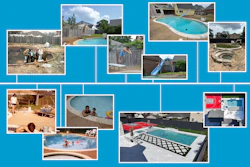
While it's no surprise that blue dominates the vinyl liner market — and probably always will — this year's crop of new patterns clearly offers choices that relate to the country's greater lifestyle trends as interpreted by color experts.
Future Color
While some industries and even businesses have their own in-house color experts, most rely on the collective wisdom of organizations like the Color Marketing Group. CMG is an international, not-for-profit association of 1,300 color designers. These professionals hold positions in a variety of industries where their responsibilities are to enhance the function, salability and quality of a product through their knowledge and appropriate application of color. CMG members forecast color directions for all industries, manufactured products and services.
Color forecasts are a lot more than a list of the hues that consumers will think are pretty this year. At the heart of a color forecast is concern for the bottom line. A color choice can mean the difference between what sells and what remains on the showroom floor. (We've all seen a sales rack full of some weirdly colored apparel that's been deeply discounted). So when color experts get together to predict palettes, selling products and services is never far from their minds. In fact, when color forecasters make their predictions, they rely heavily on consumer and demographic trends. The CMG's 2006 forecast starts off with six key influences that are driving color this year, and there's no mention of a hue, a chroma or a tint in any of the categories (see sidebar at right). But there's a lot of discussion of what consumers want, need and are feeling.
Home Sweet Hive
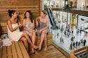
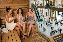
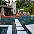
Of particular note to the pool industry is the continuing interest in the home and transforming it into a retreat, a refuge and a focus of gatherings. While yesterday's buzzword was cocooning, today's trend is better described as "hiving." People want their homes to be the center of activity for family and friends, even if that activity is just lounging poolside, enjoying the serenity of a home resort.
In fact, Sherwin-Williams, the paint and coatings giant, calls one of its four color trends for 2006 Relaxed Retreat/Spa Experience. Palest peach, spring-fresh green, sandy yellow and watery blue are some of the hues from this palette, designed to create a soothing space for relaxation. "You may not always be able to take a great vacation," says Sheri Thompson, Sherwin-Williams's director of color marketing and design, "but that doesn't mean your home can't become a refreshing destination at the end of the day."
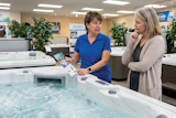
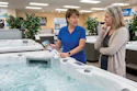
Luxury is another trend noted by both CMG and Sherwin-Williams. CMG talks of colors that communicate sophisticated craftsmanship, rare materials, high polish and burnished finishes. Sherwin-Williams mentions opulent jewelry influences of pearl, yellow gold and gemstones. Vinyl liner patterns like O'Sullivan's Rustic Tile, Canadian General Tower's Majestic, and St. Kitt's Tile from Merlin Industries illustrate these concepts for the poolscape.
The Long View
Manufacturers of durable goods have to be careful about selecting colors. They need to choose palettes that will retain their allure for years, not seasons. As you peruse the new offerings from the vinyl-liner industry, you'll see that the designers have incorporated touches of color and color effects that embrace consumer trends while avoiding short-lived fads.
Will It Play In Peoria?
ALTHOUGH WE LIVE in an increasingly homogeneous global village, thankfully there are still distinct and interesting regional variations in the way Americans dress, talk, cook and decorate their living spaces. According to the color wizards at Sherwin-Williams, exterior color themes are generally derived from a region's landscape, climate patterns and unique cultural history. While the SherwinWilliams marketers concentrate their research on colors for home exteriors, pool designers know that customers seek to create an environment that unifies their entire living space from the kitchen to the deck to the pool to the garden. Here's the Sherwin-Williams take on regional color in the United States.
NEW ENGLAND Homes reflect the area's traditional values, rich history and landscape of rolling green hills, slate-colored mountains and subdued gray waters. New Englanders prefer a conservative palette choosing lighter shades from the tan, yellow, gray and white tints. They punch up these tranquil tones with accents in navy blues and vivid berry shades, often in high-gloss finishes.
MID-ATLANTIC AND SOUTHEASTERN COASTAL Like New Englanders, homeowners along the Mid-Atlantic to Southeastern Coastal corridor prefer neutrals from the tan, gray and white color families, but they pick shades with more depth. These deeper tones reflect the natural surroundings of sand, sea grasses and the green-gray waters of the Atlantic Ocean. Despite strong sunshine in southern coastal Georgia and Florida, homes here wear exterior colors of midtoned neutrals. Trim and accents are painted in various shades of Sunbelt pastels, such as melon or orange.
MIDWEST In the nation's heartland, creams, whites and light beiges are the rule for exterior siding, while window trim, shutters and entry doors wear coats of deep burgundy or forest green. Like New England, this is an area where tradition dominates, color choices swing toward the conservative shades of the spectrum. Light neutrals blend well in virtually any neighborhood, and provide a calm canvas for the green foliage and multicolored landscaping so popular in residential communities. Light neutrals also echo the shades of wheat, corn and other farm crops that are the heart of the heartland.
SOUTH Think Southern states, and images of antebellum-era white-pillared plantation homes come to mind. Some 14 decades after the Civil War, this straightforward palette is resurging in popularity, especially in Deep South states like Louisiana. Though the region cycled through the beige family about 15 years ago, paint experts here report most new homes are sided in white or painted white. Homeowners often add cool green tones to shutters, roofs and awnings.
WESTERN MOUNTAIN Homeowners in mountain states prefer natural colors — like the mid-toned yellowy tans of the area's foliage. Love of the outdoors is reflected in the popularity of rustic, natural materials like wood siding, stained in mid tones, and stone.
SOUTHWEST In Arizona's desert regions, neutrals step down into darker tones of deep taupe and are trimmed with mid-toned shades in the same color family. Designers select neutral greens because these shades blend with the mountains and desert surroundings. But Southwestern homes also echo the area's ethnic influences. In Santa Fe, N.M. of course, sand and turquoise are popular. And, in El Paso, Texas, just over the border from Mexico, bright blues, golds and terra cottas work side by side with neutral tans and creams. These colors reflect not only the unique culture of the area, but also the terrain.
WEST COAST Pacific Coast state residents favor shades of gold, yellow, wheat and sage-tinged green for their homes, moving into a color palette that's more evocative of new millennium tones. Homeowners along the coast like cheerful yet sophisticated hues that reflect colors found in the surrounding environment. While still earth tones, these yellow and green shades move away from browns and swing toward sunny, warm colors.
THE NATIONAL SPECTRUM With the notable exception of the West Coast region, where varying levels of yellow are popular, home colors seem to begin as light and white shades along the East Coast, move to light neutrals in the Midwest and shift to mid- and deep-toned neutrals in mountain zones. While neutrals continue to dominate, research shows homeowners do like color. Increasingly, homeowners are using eyecatching colors on doors, shutters, windows and trim.
Consumer Colors
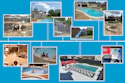
The Color Marketing Group identified these six trends that drive the 2006 color forecast. Each trend is paired with a photograph that shows how the concept translates into colors.
Techno-Organic Balance: Consumers want to find a balance in their lives between the influences of nature and the pace of technological advance. They order their lives and base purchasing decisions on this new, somewhat surreal balance.
Breathing Space: Consumers want fulfilled and rewarding lives despite the demands of work and society. To this end, they seek serenity and calm in a space that is insulated from daily stresses and emerging threats to safety, both in public and private.
Heritage with Heart: However clearly consumers remember the past, they sense a need to reconnect with it. Hope and optimism filter memories of past events, ensuring that this nostalgic journey is warm and comforting.The focus is on positive times; struggles are forgotten.
Hybrid: The synthesis of cultural norms pervades the environment. Society has evolved beyond fusion in foods, fashion and design. Now, hybrid households and communities are entering the mainstream. The move to hybridization occurs in parallel with geopolitical and economic events and is a product of the proliferation of global unification in communications, transportation, manufacturing and services. Although consumers generally accept hybridization, it offers a sharp contrast to the comfort of the predictable past.
Uber Luxury: As extravagance becomes accessible to the masses, there is a need to identify icons or symbols that convey a new level of status and sophistication. In response, icons of sophisticated craftsmanship and rare materials with high polish and burnished finishes will emerge. In fashion, Uber Luxury takes on a classic feminine style that drives decision-making and brings power to women. In the home, Uber Luxury is defined as masculine, clean simple and elegant.
Color Depth: Consumers seek bold colors and luminous materials that add glow and fluidity in product executions. Visually stimulating chromatic textures yield high-energy interest and excitement.
Source: Color Marketing Group