For several years now, trade shows seminars, trade publications (ours included) and others have trumpeted the same message: Experiential retail is the present and future of brick-and-mortar retail.
Translating that concept to your showroom, however, is easier said than done. Just ask David Isaacs, the third-generation owner of Isaacs Pools and Spas in Johnson City, Tenn. Over the course of just a few months, Isaacs executed a comprehensive redesign of his 8,000-square-foot showroom with the primary goal of enhancing the customer experience.
"This is our interpretation of what we think the new experience might look like for pool customers. Not coming into the same store over and over," he says.
Of course, it wasn't easy.
"I would have to say, in all the things I've done in this life, this is in the top five of the most stressful things I've been through," he says. "Because I know, having been in this business so long, I'm thinking through everything. How do you incorporate everything so the money spent is worth it? And everything flows like it should? How do you pull it all together and make it uniquely yours? And still be efficient? And still meet that initial goal of people loving your store?"
Here, Isaacs gives us a tour of his showroom and explains what he changed and why.
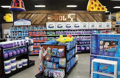 The Pool Rx wall features reclaimed wood artistically installed by a local trim carpenter.
From Stressful to Successful
Isaacs' ambitious redesign was intended to address far more than aesthetics — it also seeks to change the way customers psychologically react to the store. For that, there's no better example than the crown jewel of Isaacs Pools and Spas, the water testing station.
RELATED: Tips to Improve Your Retail Store's Appearance
"We were thinking, 'This is where everybody comes in, this is where they stand.' We asked ourselves, 'What is their experience like here?' We ultimately felt like that experience was not a positive one," he says. "Customers kept standing and looking around; we had nothing for them to look at."
Worse still was the perceptible bad mood lingering in the air.
"People spend a lot of money there, and we found it created stress for the customers. People are nervous, thinking they may have to spend $500 or $600. I wanted to make it a calmer place and create a more positive experience."
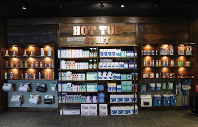 Isaac's store features boutique-style shelving with LED lighting that creates the perfect spotlight for hot tub accessories. While the shelves aren't packed with product (and therefore need to be restocked more frequently), fewer items on the shelf helps elevate the perceived value of the items.
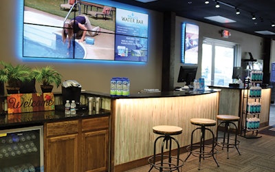
The outcome is the Water Bar, a sprawling desk area that takes design cues from an espresso bar. Guests who need a water test can grab a bottle of water (branded with the Isaacs logo) and take a seat on one of the bar stools. While they wait, they can take a look at the TVs on the back wall, which feature product videos from manufacturers as well as "today's specials," stylized like a coffee shop menu, that list the store's sales and deals. The screens also show a featured product that changes each day, providing new visual interest for returning visitors.
Note: The cluster of TV screens was an idea Isaacs adapted from Bath & Body Works. "Over Christmas, I noticed where people were shopping," he says, "and I noticed that Bath & Body Works in the mall was packed every time I went there. One item I liked in particular was the TV cluster behind the cash register, which gave me the idea for my big TV."
Speakers were placed in the ceiling directly above the bar stools, making it easy for seated guests to hear what is playing on the screen without distracting the staff behind the counter.
The bank of TV screens can also be repurposed for in-store events, like classes.
"Every second Saturday, we have a 30-minute spa school and we can put the PowerPoint on those four screens. It looks very professional," he says.
Finally, another screen was placed adjacent to the entrance. As guests wait in line to check out, they can learn more about the 40-year history of the company, which serves as a helpful reminder they are supporting a local family business.
Effective Efficiency
The remodel also elegantly addresses logistical concerns. The former cash wrap in the middle of the store, for example, could only be accessed in one position opposite of the cash registers. (Should anyone need help on the other side, staff would be forced to cross to the exit and walk all the way around, a rather inefficient process.)
In the new layout, an access point was created between the Water Bar and cash wrap, making it easy for staff to jump on a register or quickly step in to help a customer carry products to their car. The access point also visually separates the Water Bar from the cash wrap, providing customers a helpful visual cue as to where they should stand to check out.
When planning the design of the cash wrap, Isaacs added a small, but incredibly useful feature to speed up the check-out process: a lower counter adjacent to the cash register.
RELATED: Store Design: Go With the Flow
"When you ring people up, they invariably want to ask a few more questions about the chemicals. Meanwhile, the customer behind him with the bag of shock just wants to check out and get on with his or her day," Isaacs says with a laugh. "We configured it in such a way that if the customer keeps asking questions at the register, the cashier can turn away from the cash register and keep talking at the lower counter, so someone else can step in and keep ringing people out."
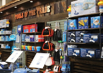 You can spot some barn tin under the shelves of the Tools of the Trade wall.
Rustic Appeal
Aesthetically, the rustic/industrial look was inspired by what Isaacs noticed at busy, hip restaurants downtown.
"I was seeing reclaimed wood and barn wood become popular, and it dawned on me that people liked their experience in these places," he says.
You can see this influence begin at the Water Bar and cash wrap, which feature siding made of reclaimed tongue-in-groove oak. The theme continues into the retail department, where you'll find reclaimed barn wood, shelves made with industrial-style tarnished pipes, barn tin and even a pair of barn doors at the threshold of the mood room.
Working with reclaimed items, however, is somewhat of a trash-to-treasure process.
"It looks like a pile of scrap when you dump it on the ground, and then when you put it up, it looks amazing," Isaacs says.
To help ensure the reclaimed materials were installed both correctly and attractively, Isaacs hired a trim carpenter with an artistic flair to arrange and install the wood and barn tin — which he attests was a bit stressful. A rusty hunk of barn tin, for example, had Isaacs doubting his vision.
"I was like, 'What have I done?' I was looking at this rusty piece of metal and the artist says, 'We're going to put this up here.' And I'm like, 'This looks awful,' But it was so impressive to watch the professional do his work," Isaacs says. "Once we got it up there, I was like, 'that looks amazing.'"
High-Impact Changes
All the aforementioned changes are enough to make for an impressive store, but Isaacs went further with several additional projects that significantly improved the showroom experience. Here are just a few:
- Polished floors. Concrete floors are popular in pool and spa stores for their rugged durability, but polishing them to a shine adds a luxe feel. "That made a huge difference in saying, 'This looks like the kind of place where you can spend some money. This is not just a warehouse where we have a bunch of dusty boxes,'" he says.
- Cheeky custom signage. The retail department has three zones, each of which has been given a fun name: the PoolRx section houses chemicals; Tools of the Trade has skimmers, automatic pool cleaners and other equipment; and Hot Tub Stuff is home to exactly that. Each section is labeled with custom-made brushed copper signage that neatly coordinates with the rest of the store's aesthetic.
- Adding more room. Previously, hot tubs were lined up right next to each other, again lending the "warehouse" feel to the store. Today, the hot tubs have more breathing room, which encourages customers to take a closer look and view them from all sides.
- An alluring scent. "We scented the store with ScentAir," Isaacs says. We're trying to hit all five senses."
- Boutique shelving and lights. As you can see in the Hot Tub Stuff section, Isaacs created "cubbies" to feature different products. He uses these shelves to highlight accessories like spa fragrances and other specialty products that, when illuminated by LED lighting, creates an eye-catching display. "We find people shopping at it more frequently," he says. "The aromatherapy portion of hot tubs is something I think we overlook, so we're trying to capitalize on that a little more."
Not Throwing Away My Shot
For Isaacs, the stakes for this redesign were high — in all, the company invested about $153,000 into the project, not to mention the countless hours of research, sourcing and management such an undertaking requires.
RELATED: Inspiration For A Retail Destination
"This was the dream retail store for me, and I had one shot at making that dream come true," Isaacs says.
So far, it appears the investment has paid off.
"People come into our store, people who have been coming here for years, and they take a step back every time they come in. The first time, they actually think they've come to the wrong place because it looks so different. So far, the investment we made in a store that appeals to all five senses is paying off, and customers are having a far better experience in our store than they ever have."
Comments or thoughts on this article? Please email Cailley at [email protected]


