It is said that when people go to a restaurant, they tend to eat with their eyes first and their stomach second. If it looks appetizing, then it's probably going to taste amazing, right?
The point is to appeal to the senses — as many as possible — and the idea holds true for pool and spa retail. Most retailers tend to focus their attention on what the consumer sees first. They know if the store does not immediately wow the customer or live up to expectations, the consumer will walk away in search of a new place to buy their products or services. But it's also equally important to consider what your customers smell and hear first when they enter your store. All five senses come together when creating a store layout that excites customers, retains them and makes them want to spend more money!
Think of it this way: If a retailer is trying to sell a premium product and the store looks bargain basement, they generally will not get, nor can they ask for, a premium price.
When you own a store, it's easy to get too comfortable with your surroundings and lose sight of the customer experience. Because of that, it is extremely important for retailers to take a look at their store by walking through it and observing everything from the consumer's point of view. Step outside of your box, so to speak, and look at your store from the eyes of two different customers.
1. The new customer. Pretend you've never even seen this store before and don't have much knowledge of the industry. What catches your eye? Where do you get lost? How could things be improved?
2. The repeat customer. This customer already knows the lay of the land and comes in for the usual chemicals and water tests. Does the store look the same with every visit? Is there anything new and exciting to catch the eye?
While doing these walkthroughs, think about the changes you can make to serve both those customers better. Some changes may seem obvious, but quite often it's the subtle changes that make all the difference. The goal of this article and exercise is to learn how to spot trouble areas and provide an effective retail store layout to maximize profits from every square inch of retail space.
From the Parking Lot…
It all starts when the customer pulls into the parking lot. The parking lot should be lined, clean and free of any clutter, with plenty of spaces up front. This is the customer's very first impression of the store and many will decide if they want to venture inside simply by the way it looks on the exterior. The entrance should be visible and/or marked, and windows should have displays with promotions and/or graphics to set the stage and prepare the customer for what they should expect.
…To the First Steps Inside
As consumers walk into the store, they should be greeted with a pleasing fragrance. I am a huge advocate for pleasant smelling stores. Studies indicate that we are 100 times more likely to remember what we smell vs. what we see, hear and touch. It's that important! In addition, 75 percent of the emotions we generate daily are due to what we smell, which is all the more reason to invest in a refreshing scent machine.
Your goal for those first few steps is to make a customer feel welcomed in your store. To help, the space around the entrance should offer at least 6 feet of space to avoid feeling crammed. This is important because if the customer doesn't feel welcome, he may turn around and walk out.
Also consider if your store's exterior is consistent with the appearance of the interior. If you create expectations from promotional banners and/or window displays that aren't met, you could lose your credibility as a retailer and leave the customer disappointed. For example, if you're holding a springtime sale and promoting it outside with balloons and signs, the store needs to reflect that also — it shouldn't look like the same store your customers are familiar with.
Sight Lines
As the consumer walks in, he or she should be able to see all the way to the back of the store and be greeted with products that are fun, such as toys, games, loungers, etc.
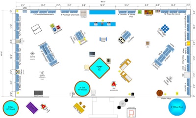
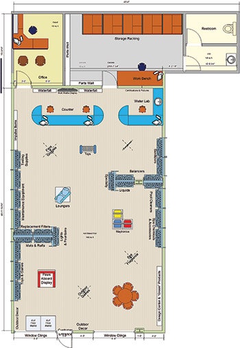 This is the store layout for Claffey Pools in Southlake, Texas. This layout features a couple end caps that display specialty items likely to catch a customer's eye.
The "staples," like chemicals, maintenance products, filters and testing supplies, should be located on the left side of the store, as customers typically move counterclockwise in the retail environment. By placing them on the left, you're giving your customers more time to move through the store and maybe pick up an extra item or two before collecting the basics and heading for checkout.
New products, vendor displays and high-margin items should be located on the right side of the store where consumers' eyes and feet tend to gravitate. As the consumer gets further into the store, they should be exposed to helpful items with good visual displays such as automatic pool cleaners, chlorine generators, lighting, fountains, energy-efficient items and eco-friendly products.
The items located on endcaps should be high-margin, sellable products that are relevant to all pool owners — not closeouts or discontinued items, but products that make you the most money.
For example, grocery stores use endcaps to promote high-profit seasonal items — it's no coincidence that canned pumpkin, cinnamon coffees and pie-making supplies make their way to the endcaps in the fall. Grocers know consumers are coming in for these items during those times, so they make sure they are on display, especially the brands of these items which make them the most money. It may not be the brand the consumer came in for, but it is easier to grab the product off the end cap than search for it in the store.
To test this theory, retailers can put a different brand of product, like shock treatment, on an end cap during the beginning of the season, mark it up 20 to 50 percent more, and watch what happens. Believe it or not, it will sell and the retailer will see a higher profit margin.
Merchandise displays should attract and interest customers rather than overwhelm and confuse them. Each display should have a focal point or a theme to catch the customer's eye and draw them in. The goal is to attract attention to the product; therefore, these displays should be kept simple and clean. Neat, even rows are often the best and most logical display strategy. Similar products should be grouped together in a logical fashion while the number of brands displayed should be kept to a minimum.
 Bachmanns Pool, Spa and Patio in Madison, Wis., emphasizes hot tubs in their store layout. Notice that the items customers routinely come in for, like chemicals and other maintenance items, are located in the far back of the store.
Clutter tends to convey disorganization, cheap products and poor management. A retailer should opt for a visually wider selection of products versus a deeply-packed section. With this in mind, opt for 6-inch hooks on wall displays instead of the standard 8-inch hooks — a long empty hook, or a hook that has just one product hanging on it, looks messy and picked over. Simply switching the size of retail display hooks can change the way a store looks and feels.
At the Counter
The area around the counter is prime retail space and should be filled with impulse products, not commodity items. Some retailers fill this area with these basic items as a matter of convenience; that way, customers can come in, grab what they need, pay for it and go. However, this philosophy goes against everything we are trying to accomplish.
The longer the customer stays in the store, the more they buy. Therefore, the classic staples should be moved to another area of the store (in particular, as I mentioned earlier, the left wall).
By doing this, retailers will find they are selling products they had never sold before simply because their customers are now moving around the store to find what they need.
Retailers should not be afraid to duplicate their retail display efforts, either. For instance, test strip displays can be placed near the water lab, at the front counter and in the water testing supply area. Children's swim goggles should be displayed at the front of the store and on a small rack near the counter during checkout.
(Just remember, keep the inventory light in the secondary locations as the display does not have to be duplicated in full scale. Simply provide a sample of the product in these secondary locations and point the consumer to the main location for more selection.)
Also, move products around to keep the store looking fresh. If a regular customer comes in and buys the same item from the same spot every week, they may not even see the other products that are offered. This doesn't mean the store needs a complete overhaul on a regular basis. But it is a good idea to rotate merchandise, change displays, and freshen up any signage on a regular basis to make the customer feel as though there is always something new for them to see and experience.
Finally, the burden of all these changes should not fall on the store owner's shoulders alone. For instance, when performing the observing exercise, make a list of what needs to be changed and share the list with the store manager and employees, and place it behind the counter where they can see it. Whenever the store is not busy, go back to the list and start checking items off. It may take a week or maybe even a year, but ultimately it will get it done.
These are just a few ways of keeping your store looking impressive to your customers. A great layout, along with excellent customer service and knowledgeable staff, are what makes an average store a truly successful one.
Comments or thoughts on this article? Please e-mail [email protected].


