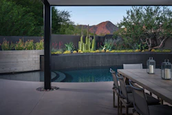


Good pool design fits in with the landscape. Great pool design, however, does more than that: It expresses emotion, it lures you in, it coalesces with the home’s design, it creates a mood.
How can a pool designer achieve such depth? One answer is color theory, which both sets a tone for the backyard and imparts a subconscious emotional impact.
“It’s not just about the aesthetic,” says Feras Irikat, creative director for Lunada Bay Tile in Harbor City, Calif. “Understanding the emotional side of color is very important, especially for today’s design and trends.”
Irikat is an expert in this field. He instructs a two-day design school on color theory for Genesis University -- the well-known, and IACET-approved, pool and spa educational organization. In the GENESIS class, students get their hands dirty, mixing colors across the palette, to understand why some colors match and others don’t. Surprisingly, students find out that mere surroundings can change how a color appears to the eye.
Luckily, you don’t need a psychology degree to understand how the color of a living space contributes to the engagement of the people who use it. To start, consider the mood you’re trying to evoke. Is it a calm space or an energizing space?
“‘How do you want to feel when you’re sitting in that environment?’ That would be my first question to a client,” Irikat says. “Once you set the stage for understanding the emotion the client wants to provoke, you can start building with color schemes that deliver this emotional state of mind.”
RELATED: The Evolution of Concrete Color in Pools
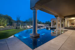
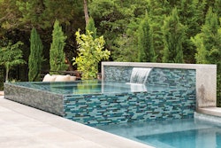
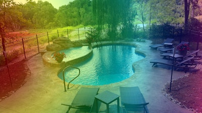
With a rainbow of colors at a designer’s disposal, the sky’s the limit for schemes and palettes. One easy starting point: the blue of the pool.
 Though all of the featured color palettes feature the signature blue of AQUA, each portrays a different emotion based on the colors it is paired with.
A high-energy environment is one meant for entertainment: pool parties, family grill outs or just an afternoon of the kids splashing around.
For a low-energy environment where the client would go to unwind and disconnect from the world, Irikat would select a monochromatic color scheme. “The eye doesn’t have a place to vibrate so everywhere it looks there is one continuous space,” he says. “Then the eye is relaxed.”
In addition to mood, consider the features of the backyard you’re working with. Warm colors, for example — reds, oranges and yellows — work best in big spaces with lots of sunlight. The bright light magnifies whites and warms the space, which can liven up an already vibrant space. Warm colors are also great for emphasizing focal points of the backyard, like fountains or statues.
Cool colors, like greens, blues and purples, are well suited for small, shady spaces. They tend to get washed out by bright sun, but in a shady setting, they add depth and dimension. (Of course, these rules aren’t written in stone — feel free to go against the grain and experiment as you see fit.)
If you’re designing a backyard with a pool, you might naturally decide on a color palette anchored by blue. But thanks to advancements in vinyl, tile and plaster, homeowners can choose more colorful options for their pool. Not only do these pools look unique, but they also open new possibilities for color schemes to pool designers.
RELATED: Hotel Pool in Morocco Has Visitors Seeing Red
“I’m excited for that change,” Irikat says. “For the longest time people could not deviate from the concept that a pool tile has to be blue, but now we’re seeing designers doing red tile or black tile. They’re doing reflective surfaces in their pools.”
Irikat directly interacts with and influences the people building those innovative pools through the classes that he teaches. For Genesis University classes, he spends 16 hours walking those possibly unfamiliar with the moldable nature of color through the endless possibilities.
Outdoor kitchens and living rooms present a unique challenge in terms of color and material selection. As these spaces bridge the backyard and the home’s interior, blurring the previously stark indoor/outdoor division, a gradual transition in style and color, from indoors to out, is ideal.
You can create this equilibrium in a couple ways. First, you can take colors from the backyard — green shrubs, the color of the house’s siding, the color of the pool water — to inform your color selection for the outdoor rooms. Or you can carry an element from the interior to the exterior: a color, pattern, material, etc. For example, Irikat often sees his clients connect their indoor and outdoor living spaces with the same tile floor.
“I love experimental design, personally,” Irikat says. “I love the idea of pushing the envelope and adding something new as long as there is a connection to the soul of that home.”
Color of the Year Every year, Pantone — a firm that created a famous standardized color system to help manufacturers achieve color consistency — reveals the color of the year, a hue that informs the coming year in all matters of design. The 2017 Color of the Year, Irikat says, is a great match for backyard designers. “Landscape architects got lucky because one of the top trending colors for 2017 is called Greenery, which is a soft play of lime green,” he says. “It’s a lighter hue and also more pastel. It’s a great color, and is embraced by the fashion industry, the interior design industry and for sure the landscape industry as well.” It generally takes a year or two for a color to move from interior design to exterior design, according to Irikat. The image shows Pantone’s colors of the year from 2010 to 2017. |