

When you’re in the showroom, or even at a trade show, take a look around. What do you notice?
Blue and white colors as far as the eye can see.
“We somehow think that if it’s a pool product, it must be blue. And if you look at a whole store that’s blue and white, it’s pretty boring,” says Gigi Carder, key account manager at Lonza. “Nothing jumps out at you.”
With this in mind, after two years of research and focus group testing, Lonza debuted a new look for its Poolife brand, which features bright, splashy colors and graphics that speak to the fun life of pool ownership.
But that was only phase one. Carder has since been on the road, visiting dealerships and convincing them to transform their showrooms by breaking away from blue and shaking things up with bright colors and big graphics. Here, two dealers share how the makeover worked out for them.
A ‘Royal’ New Look
Beth Boyle, owner of Royal Pools and Spas, owns three stores in New York; the third, located in Poughkeepsie, opened earlier this year. But according to Boyle, it was quite the fixer upper.
“The floors were literally concrete with dirt and dust and old oil,” she says. “It had been a pool store for a couple years, and before that, it was an auto parts store where they also did some lube, oil and filters. So there was still some oil on the floor from when that happened.”
Paint played a big role in the restoration: black paint was applied to the ceiling to hide cosmetic blemishes, concrete paint was applied to the floor in some places and, of course, Carder came to visit and pitch an array of paint colors, including bright yellow and orange. While she was glad to get an outside opinion, Boyle admits she was a bit intimidated by the vivid color palette.
“In my head I was like, ‘Oh my God, I’m never going to do this! I can’t possibly paint my store tangerine orange and sunshine yellow — it’s just not me,’” she says.
But after some coaxing, Boyle ordered a shade of tangerine and yellow to use on the walls. Pale blue carpet was installed and window clings depicting scenes of the pool lifestyle — think smiling kids and splashing water — were added. Boyle’s other two stores already had window clings, so she knew just how large an impact they can have.
“The building comes to life,” she says. “And customers always come and say ‘Oh, I know where you are!’”
When all was said and done, the difference was impressive.
“It’s perfect. It’s beautiful, it’s really exciting,” Boyle says. Not only did the paint give the store a new energy, but she says it was surprising how effectively the bold colors made the product stand out.
“With the bright colors we used, you can really see the product. It’s not like our other stores where product just gets sucked into the wall because the walls are white and the products are white.”
But Boyle’s not the only one noticing the change.
“Because we’re in this former pool store, and here we are, a new pool store, we have a lot of customers who walk in and say, ‘Oh my gosh, this is a new place!’ We don’t even have to tell them that we’re new, they walk in and they can see the difference, and I think a big part of that is the way we decorated.”
Creating Happiness
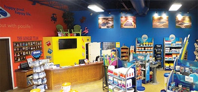
Over a thousand miles to the south, Christy Horton, office manager at Gohlke Pools in Denton, Texas, faced a similar problem: a drab retail facility in need of an overhaul. In fact, she has some choice words to describe the showroom’s former appearance.
“It was really dark and dreary,” she says. “It was painted in dark browns. We had one wall that was a darker orange and we had four or five hot tubs that weren’t displayed very well, and there was no flow.
“The store needed happiness. I felt like with brighter colors, that’s what creates happiness. That’s why we went with the bright colors: to help promote that fun atmosphere.”
Gohlke Pools was in for some big changes. The company decided to switch chemical suppliers and refresh the store’s appearance accordingly, making the transformation both an aesthetic and business decision.
“We already struggled with worrying about customers since we had been using another product for years and had to get them to switch over. We were trying everything we could to show we were in full support of the new product, and I think all the colors helped blend everything together so customers could really see a difference. Every time a customer walked in that hadn’t been here in awhile, they’d say, ‘This store looks amazing, it’s so pretty and colorful and bright.’ We hadn’t had that in a long time.”
Like Boyle, Horton was also a bit hesitant about the colorful hues Carder suggested — but not as hesitant as company owner Matt Gohlke.
“He doesn’t like a whole lot of change,” Horton says. “He likes the dark colors, so when we first started talking about painting these bright colors, he’s like, ‘Well, it’s just paint. If we don’t like it, we can always paint over it.’”
The team chose bright yellow, orange and a bold cobalt blue for the walls, which are now lined with large photos of company projects. A few large paintings, such as the company logo and the Poolife logo and slogan, keep the eye interested.
In addition, special décor was purchased to reinforce the message of fun in a more subtle manner.
“We have a balcony, and before, it held pool floats and things like that, but I went in and bought furniture and turned it into an outdoor setting. I put cushions up there, a lot of big sunflowers, and then we did a lot of the bright colored pottery.
“There’s a lot to look at, whether it be stuff that we’re selling or the decorations we put up. We’ve got people asking, ‘Are you selling those decorations?’ or ‘Where can I get those?’ You can definitely tell they’ve noticed a lot of stuff we’ve put into it,” Horton says.
In May, revenue at Gohlke was up by 9 percent — and Horton suspects the new look is a big reason why.
“To me, it seems customers are more confident in spending their money with people who are nice in a place that looks good.”
Care to DIY?

For pool and spa dealers, the way your store looks is an important part of your business, but it can also be a large undertaking to change — especially for the small retailer who wears about 100 hats. Yet you don’t have to have an extreme makeover to get customers excited about your store.
“I would say start with paint,” Horton says. “Paint’s cheap, and you don’t have to hire someone, you can do it yourself. For a lot of people, their business gets a lot slower in the winter, and they could paint and just do a lighter color.”
If you’re looking for instant gratification, buying décor items to sprinkle throughout the store can make a big difference.
“Even if it’s just some bright colored pots. I did artificial sunflowers. And you can just have that sitting around, and it kind of breaks up the monotony of pool items,” Horton says.
But if you’re interested in a bigger change, it may be a good idea to bring in help when necessary.
“I think for me, the most important thing I did was listen to someone else who was a professional in that part of the industry,” Boyle says. “I can help you solve any of your structure problems with your pool, your equipment issues, your water problems, but when it comes to color palette and what might be a better fit for our industry, I listened to Gigi. And while I was very reluctant to do it, the results are obvious. Everybody who walks into the store is just, ‘Wow, this looks amazing.’”
Comments or thoughts on this article? Please e-mail [email protected].
Setting the Mood for Hot Tubs
Beth Boyle, owner of Royal Pools and Spas, has her showroom split into two parts: the pool side, distinctive in its bright, bold colors, and the hot tub side, which utilizes different décor to send a different message.
“We painted a couple walls black and hung some big black curtains to sort of hide some of the imperfections in the wall,” she says. “And then we painted one of the walls this really nice, tranquil blue that coordinates well with the Jacuzzi logo.”
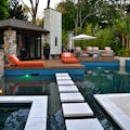
The black curtains are more than a tactic to hide flaws — they also darken the space, allowing the new overhead track lighting to really make the tubs sparkle. And the added décor, like landscaping pavers, helps shoppers imagine a tub in their own backyard.
“It’s dark. The lights are shining. It gives people that whole concept of what it could be like,” she says. “You can just see it in their eyes when they come in. I even see the difference between this store and my other two stores, because they have a lot of light on the hot tub side and we have to use language to describe the way the lights look, whereas in our new store, because we have these black walls and these curtains, we don’t have to say anything. We just turn the lights on. They get it — an instant understanding of what this would be like for them.”


