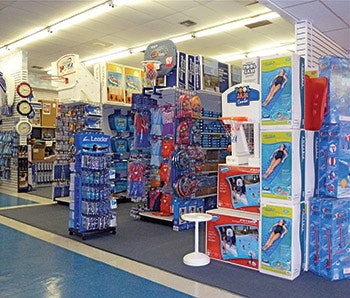
In store design and product placement, we live by the nine-square grid rule. There are areas in your store that are premium-selling spots, and other areas, which are nonproductive zones. You will want to ensure that your top categories are highly visible and the items or displays that are weak are removed from prime real estate.
Figuring out prime selling spaces versus poor selling spaces is actually quite easy. Based on numerous studies, we know that most customers follow a specific route when browsing a store. Armed with this knowledge, designing a successful store layout is a snap. Simply follow these simple steps and you’ll be on your way to creating a more dynamic, moneymaking space!
1. Place a piece of paper with nine equal squares over top of a rough floor plan of your store (see diagram. above). These nine squares represent different selling areas. Note: this diagram can be applied to any store regardless of shape or size. If you have multiple rooms/spaces in your store, apply this diagram to each space.
2. It goes without saying that your top-selling categories should be placed in superior and prime selling areas in order to drive the most revenue. The average spot to the left should be reserved for functional applications such as your cash area. (You definitely don’t want to put your cash counter in a superior selling spot.) We are a right-handed society and traffic generally flows to the right, so don’t obstruct the shopping experience, keep it flowing.
3. Backs of stores (from the diagram, Average Selling Space) are typically poor selling areas, so the best selling items shouldn’t be located there. However, you can use color and large, visually interesting posters and elements to encourage customers to venture there. Note: If your cash counter is located in Average Selling Space 1, then Prime Selling Space 2 is a great place for a display of last-minute pick-up items.
4. Beyond placement of products, focal displays are another integral component of store design. Plan on having five, seven or nine different focal-point displays interspersed throughout your space. These product groupings should be lifestyle in nature and promote end-uses to the customer. Superior Selling Space 1 is a great place for a lifestyle display. Note: Superior Selling Space 1 is an ideal spot for a stunning, over-the-top lifestyle display of products.
5. The height of your fixtures is another important consideration. Ideally, your fixtures should gradually increase in height from the front of your store to the back (i.e. lowest fixtures at the front, mid-height in the middle of the store, highest at the back). With this configuration, the entire space looks open and inviting and offers a better chance to influence movement through your store.
6. Your lighting system must provide adequate light to all corners of the store. Special attention should be given to the focal display areas and your front windows.
7. The colors you pick for your store should be soothing and not clash with each other. Your product should pop and be seen.
Your Turn!
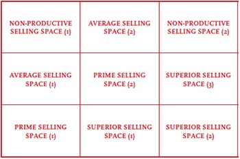
We’ve listed the nine different selling spaces below in order of importance. Write in your best-selling categories in the Superior Selling Spaces, the runners-up in the Prime Selling Spaces, etc. to start planning your space. Remember you can end up with several categories in each space or department. Evenly divide what you carry and the space you have.
#1 Superior: #2 Superior: #3 Superior: #1 Prime: #2 Prime: Average: Average: Non-Productive: Non-Productive:
Rules of Thumb
It would be nice if you could start from scratch and plan a brand new environment for your store with an unlimited budget, but you are most likely working with an imperfect retail space; perhaps the start-up budget for your store was so tight that you could not make major changes, so you made do. You had to make many compromises and you were not exactly sure what you were doing with your store design. You may be one of the many new retailers in today’s market that inherited a family business with a dated store design.
Whatever your circumstances, major store design changes should occur at least every five years. A strong store design will encourage customers to stay in your store for a longer period and enable them to see your products more effectively, which encourages more buying decisions. Statistics show that the longer a consumer is in a store environment, the more likely they are to connect with something and buy it.
Look around: Are your store fixtures an eclectic mix of colors, shapes and styles picked up along the way? Are you noticing customers who come into your store and do not stay? Do they walk all around to all departments, or do they make a quick dash in, around the front, and out? Do you know what you like in other stores when you see it, but you are not sure how to transfer that information? Does any of this sound familiar?
You can make a plan and start making changes today. It all starts with you, the owner and decision maker. Make a commitment to re-think your store design when things are slower in the year. Involve your staff; they are a great source of knowledge.
Your staff is affected by the way the store is designed as much as your customers are. What needs immediate attention? What can be put into a longer-term plan? There are many things that affect store design. Go through the following and see how much work you have ahead of you.
• Are the display windows effective? Are you noticing people coming into your store after they stop and look at your windows? Have your display windows been changed in the last four weeks? What do your props and display-aids look like — are they in good shape? Do you have the tools you need to do the job? Do you own nesting tables, cubes, risers, or crates? Do you have a grid system for hanging things? Are you bringing the window display to the eye level of the passerby?
• Have you looked up at that ceiling lately? What is happening up there; is it attracting unwanted attention? Tiles missing or dirty vent grills? Have any of these items seen a cleaning lately? Does it need painting?
• How does traffic flow through your store? Check it out — do you have a logical traffic pattern identified in your store, or are the fixtures scattered? Customers will not go into a space where they do not feel they fit. Remember, your job here is to make them stay in your store and go through it more easily so they can continue to make more buying decisions.
• Are the storefront windows clean and in good condition? Do they need repairing or replacing? Does the storefront need attention?
• When was the last time you updated your signage? Keep your sign well lit both day and night. Can customers tell by looking at your sign what you sell?
• Does your existing lighting system provide light to all corners of the store, and is there a lighting system that supports the focal-point displays in your store? Lighting is one of the most important elements in your store design and the one most frequently slighted in budgeting. You want to create a lighting environment that is bright and clean. Halogen quartz lamps do an excellent job here. Place your halogen track system on the ceiling, 3 to 4 feet in front of any display. If your ceiling is over 10 feet high, you will have to install extension bars to drop the track.
You need good all-purpose overall lighting and lighting for each shelf. Each fixture should be washed with a halogen light track, and do not forget your focal area display, each should have a dedicated halogen track. Your windows need track from the top and spots from the bottom shining up into the displays. Keep window and key focal display lights turned on throughout the night. Your store windows should work for you after-hours while also providing an increased level of security.
• Is your cash counter at the right height for the services you need to provide there? Does the customer have some space where they can comfortably put their belongings down while they are finalizing their business with you? Remember, this is an area where further purchasing decisions will be made by your customers. Is there impulse merchandise around; are visual promo messages well displayed?
• Does your floor look worn or stained? How many floor treatments do you have? Keep it simple so you can have the flexibility to change fixture placement. The best flooring options are resilient, easy to clean while still looking good, and safe to walk on in all weather. Look at low- or no-pile rugs, tile, wood or rubber floors, or painted and sealed cement.
• Are the colors you have in your store soothing, or do they clash with each other and the merchandise? Have you picked colors that are complementary to the merchandise you are selling? Are the colors consistent with all the design elements in your store, including flooring, ceiling, walls and fixtures?
Your responsibility is to create an environment where the store becomes a backdrop for the merchandise. If you are not sure how to approach this, set aside some time when you can go and visit other retail stores to do much needed research. Plan to watch a little home fashion and décor TV. Always err on the side of a neutral, or low-tone colors for your overall store design elements. Then use intense, trendy colors on the focal walls. These focal areas can be easily redone overnight or in a weekend, keeping them current and lively.
• Are you presenting merchandise in an attractive and interesting manner? Display compatible or complementary merchandise together or in close proximity. Have focal and high stocking points been utilized to attract attention?
These are some of the most important points to consider as you mold your retail store into the sort of place that draws customers, makes them want to linger and polishes your company’s image in their minds. With a determined effort, the change you can effect in just a few months work — both in the environment in which you and your customers interact and in your profit level — will amaze you!
Comments or thoughts on this article? Please e-mail [email protected].


