Every color, logo, mascot, tagline and layout choice says something before a pool pro ever steps onto the jobsite. Is the company playful? Polished? Local? Luxury? Built on tradition? Ready to stand out? On the road, those answers have to come quickly.
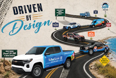
That is what makes AQUA’s annual Truck & Van Contest such a showcase of creativity. This year’s winners took different routes — from vintage charm and coastal attitude to memorable mascots, patriotic themes, milestone branding and sleek, stripped-down designs — but each one found a way to make the vehicle feel unmistakably their own.
Together, they show what happens when pool and spa pros put real thought behind the wheel. These are not just trucks and vans with nice graphics. They are brands in motion.
With that, we are excited to present this year’s winners and the vehicles that drove away with top honors.
For The Pool Specialist, the goal behind its winning truck design was simple: make the company impossible to miss.
“We wanted the truck to be highly visible, memorable and professional, so that whether it was parked on a jobsite or driving down the highway, people would immediately recognize The Pool Specialist,” says Zain Khwaja, founder of The Pool Specialist, serving the entire state of Florida.
That moving-billboard mindset guided a design process that took several months and plenty of personal attention from Khwaja. He started by photographing well-designed company vehicles he saw on the road, gathering inspiration for what might work for his own brand. From there, rough concepts were hand drawn and passed along to a designer, who turned those early ideas into mockups.
The team continued refining the design, later bringing in another designer to help elevate the concept even further. Color became one of the most important decisions. The company eventually landed on a vibrant blue, a choice that was both highly visible and naturally connected to pools and water.
“I also loved the idea of the color fading from white to vibrant blue. It gives you the feeling of walking into a pool,” Khwaja says. “That fade also helped us create a strong visual impact without having to wrap the entire front of the truck.”
From there, the focus shifted to logo placement, size and messaging. At one point, the company considered placing the logo on the front doors and listing services on the rear doors, but the layout quickly began to feel too busy. Ultimately, the team decided that the company name already said plenty.
“We realized that our name, The Pool Specialist, already does a great job of explaining what we do, so we wanted the logo to be large, clean and easy to notice from a distance,” Khwaja says.
The final design balances bold branding with thoughtful details, including the company’s license number and a tracked QR code. At first, the team did not plan to include any imagery, since all previously tested photos began to feel generic. That changed when they landed on the idea of featuring a child relaxing in a pool — a simple yet powerful visual that brought the company’s core services and message, “resurface. retile. relax...,” to life and made the design feel complete.
“For some people, the image may represent giving their children a pool they can truly enjoy,” Khwaja says. “For others, it may represent the feeling of being able to relax and enjoy their backyard again.”
The reaction has been strong, with customers and people on the road describing the truck as professional, polished and hard to miss, the company’s goal from the very beginning.
For Khwaja, winning AQUA’s Truck & Van Contest is especially meaningful as The Pool Specialist celebrates its 10-year anniversary in 2026.
“This design represents much more than just a vehicle wrap,” he says. “It represents 10 years of growth, hard work, lessons learned, dedication and a commitment to excellence.”
All photos courtesy Adam Traugott
Runner-Up
SUNSET POOLS | KATY, TEXAS
Sunset Pools Inc. in Katy, Texas, brings luxury outdoor living to the road with a truck wrap that feels as polished as the backyards the company builds.
Set against a sleek black foundation, the design uses oversized lettering, sharp orange accents and water-inspired blue graphics to create a look that’s bold without being busy. Every angle is easy to read, but the wrap still has movement — a clean, high-end design that catches attention without shouting for it.
Founder and President Adam Traugott says the design was inspired by the same philosophy that drives the company’s pool projects: “clean, timeless luxury with a strong visual identity.”
The result is a rolling reflection of the Sunset Pools brand: modern, refined and built to leave an impression long before the first shovel hits the ground.
All photos courtesy Deana Oseguera
Reader's Choice Award
JDO POOLS & SPAS | KILMARNOCK / RICHMOND, VA.
Voted on by AQUA readers, JDO Pools & Spas earned this year's Reader's Choice Award with a vehicle wrap that brings the company's work directly to the road.
The Virginia-based company uses its fleet to showcase completed pool and spa projects, giving prospective clients a glimpse of the outdoor spaces JDO designs and builds. The wrap features a full-scale backyard scene, complete with a pool, spa and surrounding outdoor living elements, turning the vehicle into a moving portfolio.
“At JDO Pools & Spas, exceptional craftsmanship and thoughtful design are at the heart of everything we do,” says Deana Oseguera, partner and marketing director. “Our vehicle wraps serve as a visual representation of our brand and showcase the custom pools and spas we designed and built for our clients.”
For JDO, the design is about more than visibility. It reflects the company’s goal of helping homeowners imagine what is possible in their own backyards. “More than just mobile advertising, our wraps reflect the quality, precision and attention to detail that define every JDO Pools & Spas project,” says Oseguera.
All photos courtesy Clayton Cowell
Sponsor's Choice Award
POOLS BY ROARK | SARASOTA, FLA.
Pools by Roark in Sarasota, Fla., caught Hayward's attention with a wrap that feels sleek, bold and unmistakably coastal. Owner Clayton Cowell says the company wanted the design to feel different, choosing a matte finish, black rims and a logo redesign inspired by surf companies and the band Sublime.
The result is a fleet look with attitude. The matte black foundation gives both the truck and van a clean, modern edge, while the warm orange and teal graphics add a laid-back Florida feel that still stands out on the road.
For Hayward, this entry rose to the top. “With a bold new logo, matte black vehicle wraps, black rims, and standout photography featuring both the truck and van, their submission immediately captured attention. The overall aesthetic perfectly embodied the surf and music culture that inspired this campaign, while still feeling authentic to their brand.”
All photos courtesy Anthony Arredondo
Best Pool-to-Pavement Branding
WEST SHORE POOLS & OUTDOOR LIVING | TAMPA, FLA.
West Shore Pools & Outdoor Living in Tampa, Fla., turned a customer-favorite pool design into a moving showcase for its brand. After receiving strong feedback on the look for a pool the company built, President Anthony Arredondo says the team decided to carry that same visual identity over to its truck wrap.
The design is sleek and atmospheric, with the feel of a finished backyard experience rather than a standard service vehicle. With sunset tones, dark silhouettes and clean white lettering, it gives the truck a polished look while still clearly communicating the company’s design, build, remodel and repair services.
According to Arredondo, the decision has paid off. The truck has received “hundreds of compliments,” proving that strong branding can make just as much impact on the road as it does in the backyard.
Photo courtesy Chris Tompkins
Most Patriotic
FREEDOM POOL SERVICE | CONCORD, N.C.
Freedom Pool Service in Concord, N.C., brings a patriotic look to the pool route with a clean white truck, flowing blue water graphics and an American flag-inspired logo.
Founder Chris Tompkins says the design reflects the company’s identity as a veteran-owned and operated business, along with its love for the country. Simple, clear and service-focused, the wrap is built around pride, clarity and purpose.
Photo courtesy Cody Young
YOUNG POOLS & EXCAVATION | CADDO MILLS, TEXAS
Young Pools & Excavation LLC in Caddo Mills, Texas, keeps its truck design bold and straightforward, with oversized lettering and red, white and blue accents against a clean white body.
“I’m just a Christian guy who loves America,” says owner Cody Young, who wanted the logo to carry an American theme from the start. The truck’s clean, confident look lets the company name do the heavy lifting.
All photos courtesy Ron Clements
A Bite of Personality
POOLTOWN HOT TUB SERVICE | REDFORD, MICH.
Pooltown Hot Tub Service in Redford, Mich., gives its service van some serious bite. The wrap features Sharky, the company's mascot, suited up as a hot tub service tech, toolbox in hand and ready for the next call.
Ron Clements says the team wanted to spotlight Sharky while making it easy for customers on the go to reach them. With a QR code, website and phone number built right into the design, the van is equal parts playful and practical — a sharp- looking wrap that works hard on the road.
All photos courtesy Chris Croley
Standout Owner-Inspired Logo
CRYSTAL CLEAR POOLS | KNOXVILLE, TENN.
Cyrstal Clear Pools in Knoxville, Tenn., puts the owner front and center with a logo inspired by Chris Croley himself, who is known around town as "the bearded pool guy."
The black-and-white design keeps the truck simple, personal and easy to recognize — proving that sometimes the strongest brand identity is the person customers already know.
All photos courtesy Ashley Carter
Best Use of Pool Texture
INTEGRITY POOL SERVICE | HARKER HEIGHTS, TEXAS
Integrity Pool Service in Harker Heights, Texas, uses its truck wrap to bring the look and feel of the pool surface onto the road. The blue tile background was inspired by one of the team's favorite pools on its route, while layered water graphics and splashes around the wheel wells give the vehicle a sense of movement — as if the truck is cutting through water on its way to the next service stop.
The company says the design is also rooted in its message. By highlighting the “GRIT” in Integrity, the wrap reflects its commitment to “no excuses, just results.” Even the small water wave above the “i” was carried through the design, becoming a dynamic element across the truck.
The hood adds one final touch of personality: “Dive in! We’ll handle the GRIT.” Combined with the company’s promise of top-quality service, genuine care and integrity in the details, the wrap balances texture, message and personality while staying true to the brand.
All photos courtesy Duane Hilburn
Best Brand in Flight
WOOD DUCK POOL & PATIO | SAN ANTONIO, TEXAS
Wood Duck Pool & Patio in San Antonio, Texas, knows how to make its brand take flight. With bold water graphics, clean lines and a wood duck front and center, the company's truck is anything but a sitting duck.
Owner Duane Hilburn says the design reflects “where attention to detail meets craftsmanship,” a fitting message for a company focused on custom pools, patios and outdoor spaces. From the flowing blue wrap to the memorable mascot, this truck waddles the line between polished and playful — and lands it beautifully.
All photos courtesy Nick Belancin
Vintage Ride
POOLS OF FUN | PLAINFIELD, INDIANA
Pools of Fun in Plainfield, Ind., takes a classic approach to mobile marketing with its vintage Volkswagen truck, a charming ride that looks right at home cruising through the neighborhood.
General Manager Nick Belancin says the company wanted to honor the vehicle’s original vintage character while still promoting the Pools of Fun brand. With its soft blue finish, retro shape and “POOLFUN” license plate, the truck delivers personality before it even delivers product.
And yes, this old-school ride still earns its keep. According to the company, the Volkswagen is more than a conversation starter — it is also used to deliver chemicals right to customers’ doors.
Photo courtesy Bob Castle
The Local Legend
BEST POOLS TAMPA | TAMPA, FLA.
Best Pools Tampa owner Bob Castle wanted a truck that made a statement — and his yellow 2003 Ford Ranger Edge does exactly that. Inspired by the lowrider cars he grew up around in the Bay Area of California, Castle gave his pool truck an old-school, mini-truck style designed to stand out.
The bright yellow paint, black wheels and bold door graphics give the vehicle a fun, unmistakable look, especially parked in front of Tampa’s colorful city mural. For Castle, the goal was simple: create a truck that attracts attention and is fun to drive, especially when so much of the workday is spent on the road.
It has worked. Castle says everyone in the company’s service area knows the yellow Ranger, with people often honking or stopping to take photos. More than a service vehicle, it has become a rolling piece of local personality.
All photos courtesy Jake Skipper
Most Reflective Ride
SKIPPER POOL & SPA | DALLAS, TEXAS
Skipper Pool & Spa turns reflection into branding with a fully wrapped truck finished in the same custom reflective material owner and operator Jake Skipper uses on his equipment. The idea started with his interest in mirrors, water and anything that catches light in a bold way — a concept he says carries into both his pool work and his brand.
The design follows the colors in the company logo, moving from darker green tones into clean, bright blues to represent the transformation of water from dirty to crystal clear. For Skipper, the goal was to stand out in a way that feels intentional and professional, while tying the truck back to water, light and the results his work is known for.
All photos courtesy John Sciacca
A Bounty of Brand Recognition
POOL PIRATES | JUPITER, FLA.
Pool Pirates in Jupiter, Fla., has a fleet that's hard to miss on the high seas — or the highway. With crashing blue water, a treasure chest, skull-and-crossbones flag and a pirate armed with a skimmer, the wrap goes all in on the company’s name while keeping its message shipshape.
Owner John Sciacca says the design was built around three goals: brand identity, pool industry relevance and versatility across vehicles, shirts, merchandise and digital use. That balance gives Pool Pirates a look that feels fun, cohesive and ready to sail from one service stop to the next.
Photo courtesy Dan Arvidson
Most Memorable Mascot
ARVIDSON POOLS & SPAS | CRYSTAL LAKE, ILL.
Arvidson Pools & Spas in Crystal Lake, Ill., lets its penguin mascot take the wheel — or at least enjoy the ride. Used for pool and spa deliveries, the truck features its feathered friend floating through bright blue water graphics with a cheerful “WahOoooO!” overhead.
Owner Dan Arvidson says the penguin shows up in different ways across the company’s branding — sometimes with a float, sometimes with a tool belt or construction hat. On this truck, he’s just having fun in the water, giving the delivery vehicle a playful look customers can recognize on the road.
Photo courtesy Dillon Brooks
PRIMARY POOLS | VENTURA COUNTY, CALIF.
Primary Pools in Ventura, Calif., proves that a memorable mascot can go a long way. With a neon green turtle, bright blue backdrop and bold orange accents, the wrap was designed to catch attention quickly — and stay in customers' minds long after the van drives by.
Owner Dillon Brooks says he wanted a color scheme and logo that people would remember, adding, “Who doesn’t like a turtle?” The strategy seems to be working: Primary Pools now has two vans and five trucks, and Brooks says the logo has helped the company become a remembered name for pool service, repair and remodel work throughout Ventura County.
All photos courtesy Reid Richey
Pool Patrol With Purpose
CLEARWATER OASIS | MEDFORD, ORE.
Clearwater Oasis LLC brings a protect-and-serve mindset to its fleet design with a badge-style logo inspired by CEO Reid Richey’s brother, a police officer, and the company’s support for law enforcement. The “Cabana Boy Clearwater Oasis Pool Patrol” emblem gives the wrap a distinctive identity, while the palm trees, sunset and pool imagery keep the look tied to backyard service.
The design also makes the company’s work easy to understand, listing key services alongside a clear phone number and website. For Richey, the message is bigger than branding: It reflects the company’s commitment to protecting clients’ families by keeping swimming pool chemistry safe.
All photos courtesy Braden Geis
Best Milestone Branding
ZODIAC POOLS AND OUTDOOR LIVING | SANGER, TEXAS
Zodiac Pools and Outdoor Living LLC in Sanger, Texas, turns its service truck into a rolling escape, carrying the company's "Escape the Everyday" message from one backyard to the next. The blue-and-white design, soft waterline effect and bold logo placement give the truck a clean, polished look without feeling overdone.
Braden Geis says the company wanted a design that would catch attention while also building trust through its 50th anniversary logo. It does both, celebrating the company’s history while keeping its outdoor living message front and center.













 All photos courtesy Adriana Samanez
 All photos courtesy Adriana Samanez


 All photos courtesy Adam Traugott

 All photos courtesy Deana Oseguera

 All photos courtesy Clayton Cowell

 All photos courtesy Anthony Arredondo

 Photo courtesy Chris Tompkins
 Photo courtesy Cody Young
 All photos courtesy Ron Clements

 All photos courtesy Chris Croley

 All photos courtesy Ashley Carter


 All photos courtesy Duane Hilburn

 All photos courtesy Nick Belancin


 Photo courtesy Bob Castle
 All photos courtesy Jake Skipper


 All photos courtesy John Sciacca

 Photo courtesy Dan Arvidson
 Photo courtesy Dillon Brooks
 All photos courtesy Reid Richey

 All photos courtesy Braden Geis