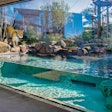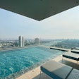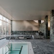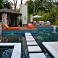
How do most water professionals make a selection of a material? Typically, they start with a catalog or old invoice from the last project. Then they most likely pick what they did on the last project. Think I’m wrong? Look at most pools in print and compare them — you’ll see there are only about a half of dozen material combinations that are repeated over and over again. Sometimes there are subtle variations, but it is rare to see drastically different texture or color selection.
What should an aquatic designer do when selecting materials? The first step: Look for answers in other design disciplines. Professional designers, architects and artists start with a thought or emotion that they want to convey. Then they try to find a color or materials that syncs up with that emotion or thought. Their choices are a ramification of an idea — this is real design.
The process of selecting textures and colors is then based within you, and not from the outside. The feeling or choice is only refined by the outside world. Criteria such as permeability, cost, feasibility and availability are factors that fine-tune the materials, but do not govern the main theme of them. Artisan-based design vs. product-nased design — the aquatic designer follows the artisan path every time.

Color
There is no greater influence over our emotions and motivations than color. Think not? Artist, product manufacturers, marketing professionals, designers, and retail sales establishments all know this truth. It is how they make their millions.
Judith Corona, one of the foremost experts on color in the country, taught me how the color of materials and lighting can drastically influence our buying habits. For example, McDonalds selects the color of the light at the order counter to be a warmer hue, while the eating areas feature a washed-out blue/white light. This is a deliberate choice — the color at the counter excites our buying habits, while the lighting at the tables encourages us to eat quickly and make room for more patrons. This color psychology is key to their profitability.
Aquatic designers can employ this same knowledge. Swimming pools are mostly white in color with some tile accents of blue. This is a financial ramification of builders choosing what is readily available and simple for them. However, the aquatic designer attempts to influence our behavior by using color to alter our emotional state just like in a retail sales environment.
If a design is supposed to convey a cold, clean feeling to its visitors, then the blue/grey spectrum will enforce this reaction, especially when paired with similar lighting. But also consider that people are drawn to warm colors. If the area along a pool is designed to push people to the spa area, for example, then the plaster and tile in the pool should be a deep green or grey, while the spa’s plaster should be a rich, ripe orange.
The aquatic designer doesn’t just pick what’s on the sample board — he or she demands the color that is right for the design and the desired emotional response. This is the artistic process.
If you’re looking for a place to start, companies like Pebble Technologies are showcasing thousands of plaster colors with Artisticolors with their PTX-Colors, while Cactus Tile and Stone is sharing a tapestry of mosaic color through tiles such as Sicis and Lightstreams. Products like these are not chosen from sample boards. There is a process of thought and emotions that is consolidated first and then the color and/or material choice is a byproduct of that process.

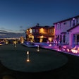
The bottom line: sticking with material choices out of habit or availability is ludicrous. An aquatic designer might select different materials on every project he or she does…but only if it is the right thing to do. For example, Michael Logsdon of Texas has created some wonderfully simplistic round pools using materials that draw certain characteristics out from the project site. (See right.) He did so to help ground his creations and provide a sense of connectivity with the surrounding terrain. If these vessels were more grandiose, then they would have lost their appeal and charm. Sometimes simple solutions are the best for a situation. These projects even incorporate the color of the sky that reflects in the metal of a water tank. WOW!
Open Call
I would like to hear from you about material and color choices you have made. More importantly, I would love to hear why you made those choices and what were you trying to convey with the selections.


